Click to enlarge
Following the decision to base the poster on my own schedule, I spent a few days tracking the things I do at work and how long I spent on them. Tracking the schedule provided enough information to create a generic schedule that showed the different activities I do throughout the day.
The poster was created in Inkscape, a vector graphics editing program. I like using vector graphics for infographics because it’s easy to resize different elements without suffering a loss in quality. Vector images should look clean and crisp even when they are shrunk to a smaller size or blown-up to a larger one.
While the instructor encouraged us to include drawings of human figures in our posters, I wasn’t sure they would work well in this case. Most of what I do involves sitting in front of a computer and if a co-worker stepped into the office, they wouldn’t tell if I was in a meeting, checking email, looking at tickets or watching training videos. All of these tasks are visually similar to an outside observer, so I wanted to create images that show them as distinct activities.
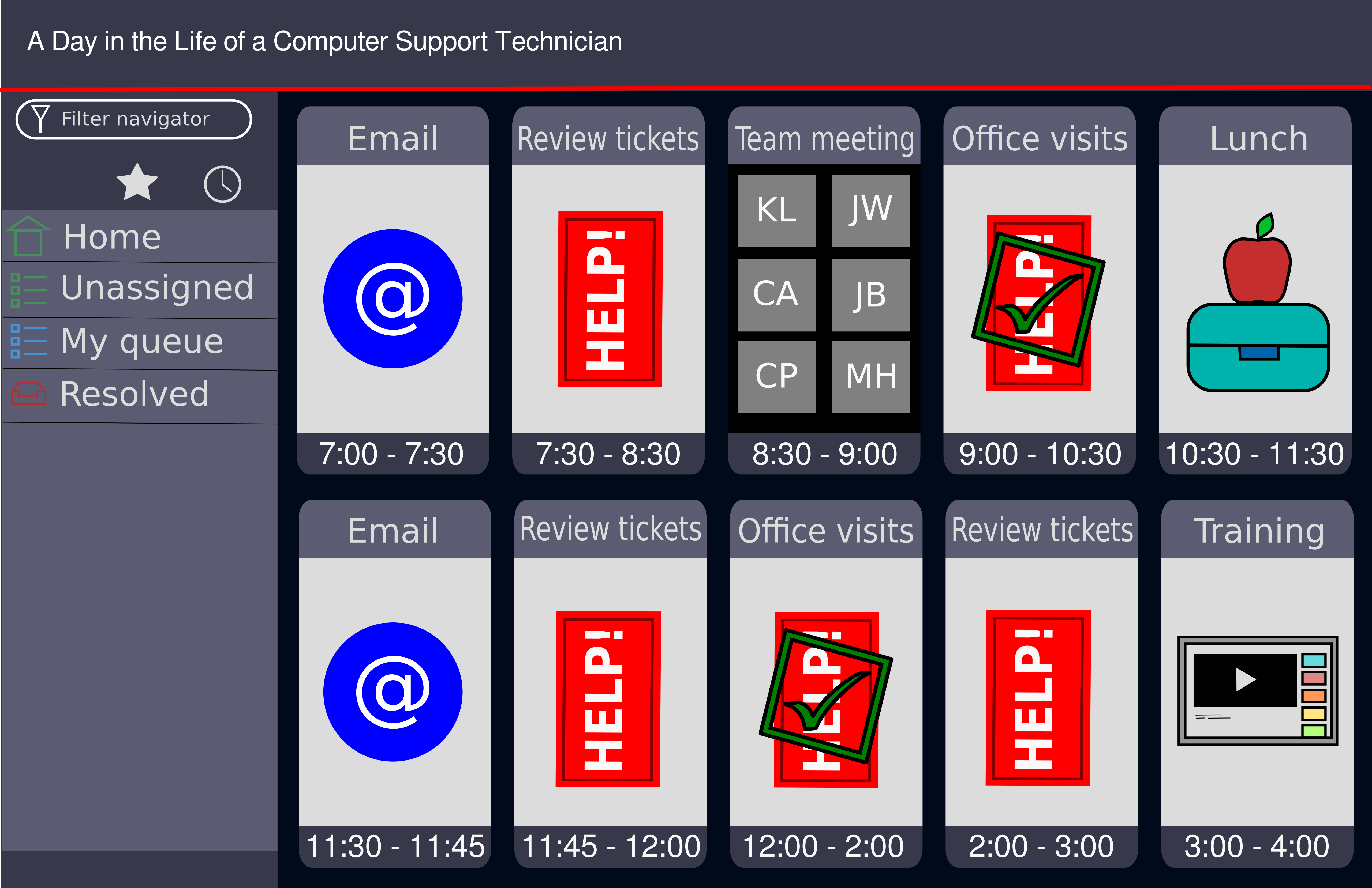
The poster as a whole is meant to resemble ServiceNow, which is a ticketing system used where I work. Whenever a person contacts our unit about a technology problem, a ticket is created in ServiceNow. This has a description of the problem and information on how to contact the person who is having problems. A large portion of the day is spent working in ServiceNow, so it seemed like a good way to represent the schedule.
After logging into ServiceNow, the first thing a technician sees is a dashboard. The dashboard presents a variety of information in different blocks, usually with charts and graphs. Since the information is presented graphically, it gave me the idea to use them to show the activities I do during the day.
The schedule had ten distinct blocks of time that I devoted to different activities, so the “dashboard” needed to display that many. Keeping in mind that the amount of text had to be limited, this ruled out displaying them in a table or spreadsheet format. Since each activity needed to be represented graphically, I spent some time considering the best way to arrange the blocks and display them. In ServiceNow the blocks are laid out horizontally, but because it’s a website it’s possible to scroll up and down to view more rows of blocks. This isn’t possible in a poster, so this constrained my choices somewhat. I wanted each of the blocks to be the same size, to show they each had equal importance. While I thought about doing two columns of five blocks, I wasn’t sure this layout would give me enough space to graphically represent the activities. Arranging the blocks in two rows of five blocks meant each block would be big enough to display a graphic that wouldn’t require someone to squint to see it. One of my classmates commented that the blocks looked like smartphones, though this wasn’t the intention.
Although I thought the graphics would do a good job of representing the tasks, they were also abstractions which could be misinterpreted without additional context. To give context to the graphics and use up some of the whitespace at the same time, I gave each block a head and a footer. The header would have the name of the activity and the footer would show how much time I spent on it.
Creating a graphic to represent email was pretty simple. The @ symbol is inextricably linked with email, so it was an obvious choice. Less obvious were the colors. Looking at the icons for most email software, I noticed that most of them were shades of blue and white, so this helped me decide on the colors for the email graphic.
The graphic for the team meeting was also pretty easy to create. Out of necessity for social distancing, we got in the habit of meeting virtually during the pandemic, and when the restrictions on meeting physically were lifted, we continued meeting online. The meeting is a videoconference that takes place in Microsoft Teams which displays attendees as grey rectangles with their initials. This made it easy to decide how to represent the meeting.
The question of how to represent lunch was a bit difficult. There are so many ways of representing food, it was hard to come up with something that seemed original. Pondering graphics used to represent food, meals, or places to eat, I kept thinking about images of knives, forks, and spoons, or of plates surrounded by knives and forks. They seemed too generic and would be hard to consider as “original”. Looking online for inspiration, I saw some representations of lunchboxes, which seemed intriguing, but they all needed to include something to indicate their association with food. For my graphic, I created a simple box with a line and a latch in the middle to indicate that the box had upper and lower halves that could be separated. I added a drawing of an apple to indicate the box’s association with food.
Most of the training I do involves watching videos on Udemy or LinkedIn Learning. Although I rarely watch training videos on YouTube, I felt this would be the video site most people would be familiar with, so I modeled the graphic after the YouTube website. The black box with the white triangle is meant to be the video being watched while the small boxes to the right represent videos suggested by YouTube’s algorithm.
Creating the graphics for reviewing tickets and visiting offices took some thought. For reviewing tickets, my first thought was to create a small version of ServiceNow, but I dismissed this since it seemed too literal. Similarly, for office visits, I thought about drawing an office door, but this seemed too abstract since it didn’t indicate what I do when visiting people’s offices.
Thinking about movie tickets or concert tickets, I decided to create an image of a ticket to represent the ServiceNow tickets I work on throughout the day. Red is a common color to indicate problems, but I added the word HELP! to symbolize that each ticket is a person asking for help with a technology problem.
When visiting offices, I’m normally working on a ticket, so using that graphic was a good starting point for this image. During most office visits I’m able to solve the problem and close the ticket, so I used a green checkmark in a box to indicate the ticket was solved. By putting the box and checkmark askew, and covering the ticket underneath, I wanted to convey that there was a problem but that it was now solved.
The assignment also had students create utility statements for their posters, explaining the audience, and what they might understand from viewing them. The hypothetical audience for my poster would be students at a job fair, who were looking at different employers and considering different careers. Computer support is sort of a hidden profession since most people don’t think about it until they need help. This leads to some misconceptions such as all we do is talk to people on the phone. With the poster, I hoped to give students a better idea about what we do, and encourage them to ask questions to find out more.