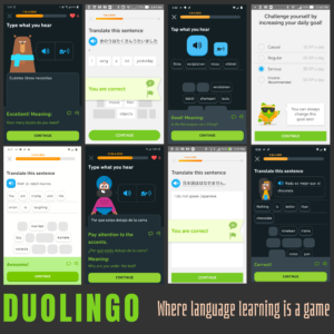
Due to my fondness of Duolingo, it was the first company that came to mind when students were given an assignment to nominate an EdTech company for a hypothetical award in a class on current trends in educational technology. The final product of the assignment was to create an infographic that was image heavy, light on text, and would give an average person on the street enough information that they would understand what the company does.
Reading the assignment, it didn’t take me long to decide it would be a great way to put those Duolingo screenshots to practical use. Rather than using a single screenshot, I wanted to put several of them in a collage to give the reader a better idea about the breadth of languages that are taught by the app. The first step was to find the best candidates to include. Over the years, I’ve used Duolingo on several devices, so the screenshots came in a variety of sizes, themes, and languages. This variety was both a help and a hindrance.
It was helpful in that I wanted to show Duolingo had several languages a person could learn, and it was also helpful because the different themes would let me create a checkerboard pattern with the screenshots. The different sizes were a hindrance because I couldn’t find a way to arrange them in a visually-appealing way. To fix this, I used an image editor on my home computer to cut-and-paste, to crop, and to scale until the chosen screenshots were all a uniform size.
In addition to the screenshots of lessons, I also wanted to include one that showed the game aspect of Duolingo. There are a few ways to present Duolingo as a game, but to make it uniform with the other images, I opted to use a screenshot showing the daily goal and how it could be adjusted to levels that are easier or more difficult.
While the instructor said we should use Adobe Story for the assignment, since the only product of the assignment was to be an image, any image editor would have worked. While I have experience using a variety of raster and vector based image editors, for this assignment I opted to use Polotno Studio. Polotno Studio is a website where people can create images using a wide variety of templates for backgrounds, icons, fonts, and patterns, and without needing to sign up or pay anything. This was my first time using Polotno Studio and the assignment was a good reason to experiment with what it could do.
To keep project simple, I resized the background to make it square. The next step was to decide on colors. Duolingo has a bright green owl mascot, so including a bright green was obvious. However, I didn’t want to make it the background since it might detract from the screenshots. I opted to use bright green for the word Duolingo, and chose a greyish-brown for the background since it would contrast the green and would be dark enough that it wouldn’t detract from the screenshots. The subtitle was a light beige color which contrasted with the background, but wouldn’t overwhelm the reader.
Next, I uploaded the screenshots to Polotno Studio and used its tools to make them aligned and evenly distributed. With this, the image was finished. I saved it to my computer and turned it in.
