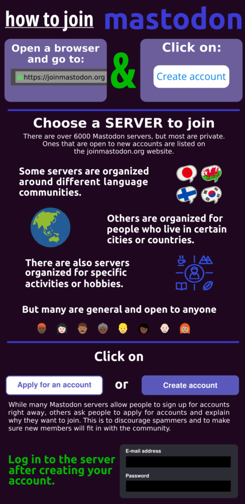
One of the criticisms of Mastodon has been that it’s difficult to create an account because people have to decide what server they want to join. The intention of this infographic is to help people understand the different types of communities that create Mastodon servers, and hopefully help them decide which server might be right for them. As someone who’s had a Mastodon account for a few years, I hoped my perspective might alleviate some of the confusion.
Though the assignment would have allowed me to simply state the steps for joining a server, my experience in writing instructions is that sometimes certain steps need to be explained to give the reader a better understanding about why things are the way they are. On the Join Mastodon website there is a block of text that says how many Mastodon servers are up and running, but looking through the servers that people can join, it’s readily apparent that they’re only a small portion of the total. To help people understand this, I thought it would be useful to include a brief paragraph explaining that servers can be private, but others are open for new accounts.
Infographics work best when there is just enough information to be useful to the reader, but this is a fine line. Rather than detailing the different communities that run Mastodon servers, I broadly categorized them based on some patterns seen while studying the Join Mastodon website. One of the patterns I noticed was the number of servers that were setup for different language communities. Languages don’t have flags per se, but it’s common practice online to represent them using the flags of countries strongly associated with them. It’s not a practice I encourage, but when I came across a website that had some public domain speech bubbles, I thought they would work well for this project. Speech bubbles represent languages, and these particular languages (Japanese, Welsh, Finnish, and Korean) are strongly associated with certain places (Japan, Wales, Finland, and South Korea, respectively).
Flags are good for representing geographic locations such as cities or countries, but since I used some to represent language communities, I didn’t want to repeat that idea since it might lead to confusion. Thinking about the word geography brought to mind a World Geography class I had in grade school, and thinking about the world made me think of a globe. A quick online search for public domain globe icons came back with hundreds of examples. The globe icon for this infographic was chosen primarily because of it was very simple with only two colors; green representing land masses and blue representing oceans. This globe icon was also chose because it showed Australia, and one of the larger Mastodon servers is run for people who live there.
Selecting an icon or icons to represent activities or hobbies was more difficult. So many servers have been setup by different hobbyist communities, it would be impossible to show them all, so I instead searched online for icons that would represent the the broader idea of hobbies or activities. The chosen icon has a figure of a person in the center and they are surrounded by figures representing different activities, and they’re intended to represent the different activity or hobbyist communities using Mastodon.
For the servers that are open to anyone, using emoji that represent different ages, races, and genders seemed the best way to demonstrate these servers truly are open to all.
Following the explanations about the different communities that organize and run servers, I thought it would be a good idea to explain why some servers required people to apply to join while others allowed people to sign up right away. The website doesn’t explain this and I had seen people complain they didn’t understand why some servers required people to apply first.
The infographic was created in Inkscape, an open-source vector-graphics editing program. The advantage of using vector graphics in this infographic is that it can be quickly resized and used online or in print without suffering a loss in quality. A raster graphics image might have issues with pixelation if printed or scaled to a larger size. It’s hoped the graphic will be shared widely by others who want to encourage friends and family members to join Mastodon as an alternative to mainstream social media.
