Click to enlarge
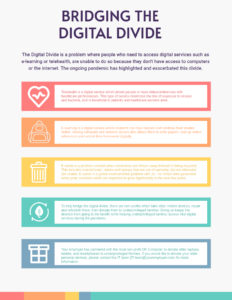
A class on current technology trends in education provided several opportunities to try out new ideas that prospective teachers and instructional designers could use in their classrooms. The class spent a few weeks on the topic of the Digital Divide and at the end we were to turn in an infographic that presented some key ideas about it. The goal was to inform people about what the digital divide is, provide some examples of how it affects people, and what people can do to help “Bridge the Digital Divide.” In this infographic I presented some examples of how people are affected by the digital divide, and proposed a hypothetical program where their employer is working with local non-profit to refurbish older computers, smartphones, and tablets, which would then be donated to families in need.
The infographic was created using Polotno Studio and began with a template available on their website. The text was changed to what I had written for the assignment, and the icons in the table were changed to one more appropriate for the section they represented. The colors were kept the same as those in the template, but in retrospect I should have either should have changed those or made the background darker so they stood out more. The low contrast between those colors and the background means most of the text is difficult to read.
